
I had this lightbulb moment last year when I realized my entire apartment was decorated in warm terracotta and sage green, but my closet was full of cool-toned grays and blues. No wonder getting dressed felt so disconnected from my space! Once I started thinking about color holistically—across both fashion and decor—everything became so much more cohesive and intentional.
Let’s start with the classic neutral palette: black, white, gray, and beige. In your wardrobe, this creates that effortlessly chic Parisian vibe where everything mixes and matches. In your home, it’s sophisticated and timeless. I use this as my base for both—crisp white walls and black accents in my apartment, and those same colors as my wardrobe foundation. Then I add warmth through textures and small pops of color.
Earthy tones are having such a moment, and for good reason—they’re calming and versatile. Think terracotta, olive green, rust, and warm browns. I wear these colors constantly in sweaters and jackets, and they look equally beautiful as throw pillows or in a piece of pottery on my shelf. This palette makes both your closet and your home feel grounded and organic.
The coastal palette of navy, white, and natural tan works beautifully in both contexts. Navy blazers and white button-downs are wardrobe staples, and those same colors create a fresh, clean look at home with navy accent walls or white linen curtains. Add in some natural wood tones and jute, and you’ve got a cohesive look that flows from what you’re wearing to where you’re living.
Monochromatic schemes are my secret weapon. Pick one color and use different shades of it everywhere. I went through a phase where everything was various tones of gray and white—my outfits, my bedding, my walls. It sounds boring but it was actually incredibly sophisticated. The key is varying the textures and finishes so it doesn’t feel flat.
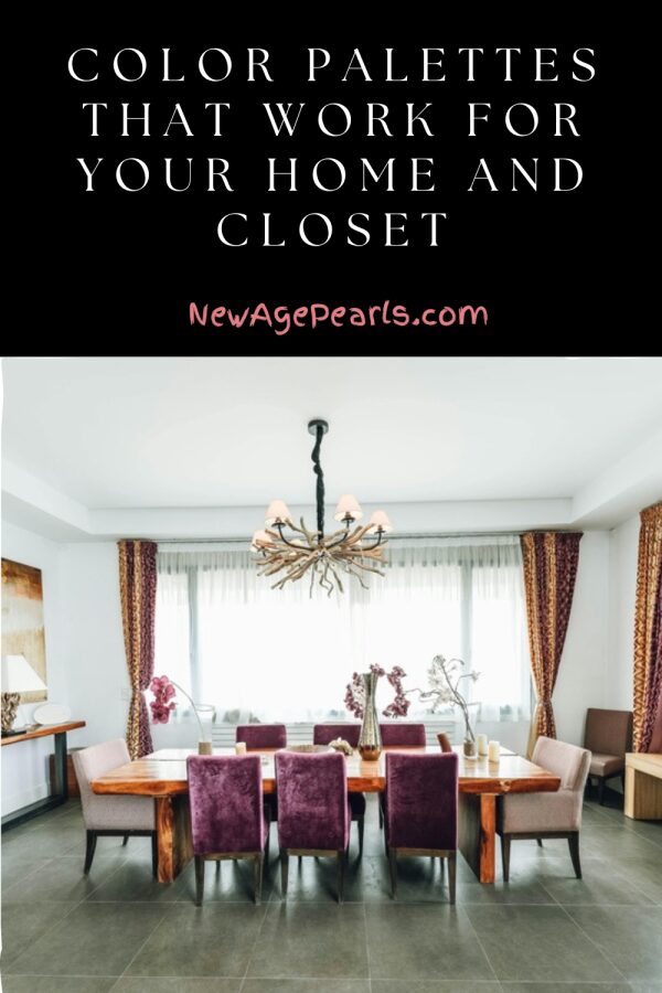
If you love color, try the jewel tone palette: emerald green, sapphire blue, ruby red, and amethyst purple. These rich colors look luxurious in velvet furniture or silk scarves alike. I use them as accents against neutral bases—a jewel-toned armchair in my living room and a matching silk blouse in my closet create such a nice connection.
The Scandinavian palette of soft whites, light grays, and pale woods with black accents translates perfectly. Think of those minimalist Scandi interiors—they use the same color philosophy that makes a capsule wardrobe work. Everything is light and airy with strategic dark accents for contrast.
For something warmer, the desert modern palette combines sand, terracotta, dusty pink, and sage. I’ve built my bedroom around these colors and started incorporating them into my wardrobe too. A dusty rose sweater echoes the throw blanket on my bed, and my sage green jacket picks up the color of my living room curtains.
Here’s my practical tip: take photos of your favorite room in your house and your favorite outfit. Pull them up side by side and look at the color stories. Are they speaking the same language? If not, you don’t have to overhaul everything—just start making small shifts. Maybe add a throw pillow in a color you wear often, or buy your next sweater in a shade that exists somewhere in your home. Over time, this creates a beautiful harmony between your personal style and your space.
Leave a Reply