
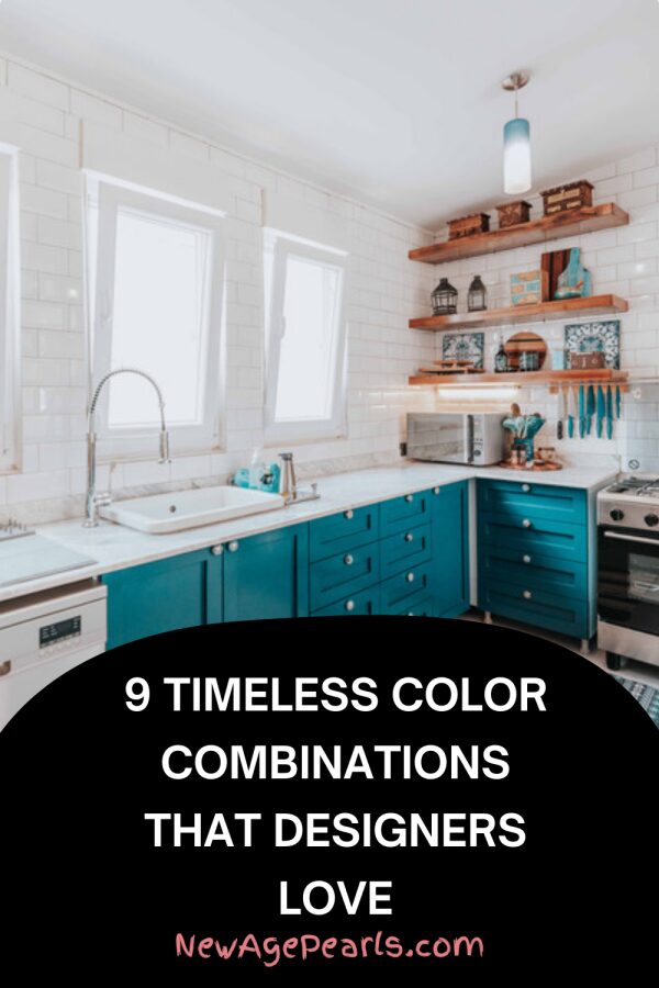
Trends in home decor shift constantly, but certain color combinations transcend passing fads. These pairings have proven themselves over decades—even centuries—of design evolution because they work with human psychology, light, and space in ways that consistently please the eye. When you build your home around these reliable combinations, you create a foundation that won’t feel dated in five years. Here are nine color partnerships that designers trust again and again.
Navy and White
This nautical-inspired combination brings crispness and sophistication to any space. Navy provides depth and drama without the heaviness of black, while white keeps things bright and open. This pairing works equally well in modern, traditional, and transitional spaces. Navy grounds white’s starkness, and white prevents navy from feeling too dark. Add brass or natural wood accents, and you have a combination that feels both classic and current. This duo succeeds because it offers high contrast without harshness—your eye can rest here.
Warm Gray and Blush
For those seeking softer palettes, warm gray paired with dusty pink or blush creates sophisticated, calming spaces. This combination reads as contemporary without being trendy. Gray provides neutral grounding, while blush adds warmth that prevents the space from feeling cold. This pairing particularly shines in bedrooms, living rooms, and bathrooms. Add cream or ivory to lighten the palette, or introduce charcoal for definition. The key is choosing warm grays with slight brown or beige undertones rather than cool grays that can clash with pink’s warmth.
Forest Green and Natural Wood
Deep, saturated greens paired with warm wood tones create organic, grounded spaces that feel connected to nature. This combination has endured because it mimics the natural world—trees and foliage. Forest green adds richness and sophistication, while wood tones keep spaces feeling warm and approachable. This pairing works beautifully in studies, dining rooms, and bedrooms. Layer in cream, cognac leather, or brass for additional warmth. This combination appeals across design styles from traditional to modern because it’s rooted in nature rather than fashion.
Black and Cream
Stark black and white can feel harsh, but softening white to cream creates a sophisticated, livable combination. Black provides graphic punch and definition, while cream adds warmth that pure white lacks. This pairing has been used in everything from French interiors to modern spaces because it’s inherently elegant. Black grounds cream’s softness, and cream prevents black from feeling too severe. Add natural materials like wood, rattan, or linen to keep this combination from feeling too formal. This duo particularly succeeds in kitchens, dining rooms, and entryways where you want to make an impression.
Terracotta and Olive
These earthy tones create warm, Mediterranean-inspired spaces that feel both timeless and current. Terracotta brings warmth and energy, while olive green adds sophistication and depth. Together, they create spaces that feel organic and lived-in. This combination has roots in Italian, Spanish, and Southwest design traditions, giving it historical credibility. Layer in cream, natural wood, and woven textures for a complete palette. This pairing particularly shines in living rooms, kitchens, and outdoor spaces where you want warmth without boldness.
Camel and Soft White
This combination creates warm, minimalist spaces that feel expensive and serene. Camel—think cognac leather, caramel throws, or tan upholstery—provides richness without darkness. Soft white keeps things light and open. This palette succeeds because it’s neutral enough to work with many styles while still having personality. It’s particularly effective in modern and Scandinavian-inspired spaces where you want warmth without color. Add black accents for definition or natural wood for additional texture. This combination never feels dated because it’s based on natural materials rather than paint trends.
Charcoal and Mustard
For anyone willing to embrace bolder palettes, charcoal gray paired with mustard yellow creates dynamic, sophisticated spaces. Charcoal provides depth and grounding, while mustard adds energy and warmth. This combination has mid-century roots but works in contemporary settings. The key is using mustard as an accent rather than overwhelming the space—think throw pillows, art, or a single chair. Charcoal prevents mustard from feeling juvenile, and mustard keeps charcoal from feeling heavy. Add natural wood and cream to complete the palette.
Soft Blue and Warm White
This combination creates serene, spa-like spaces that feel both calming and clean. Soft blue brings tranquility without coldness, while warm white provides brightness. This pairing works beautifully in bathrooms, bedrooms, and coastal-inspired spaces. The success of this combination lies in its association with sky and clouds—inherently soothing. Add natural textures like jute, linen, or driftwood to prevent it from feeling too precious. Choose blues with slight gray undertones for sophistication rather than baby blue, which can feel juvenile.
Burgundy and Sage
This unexpected combination creates rich, layered spaces with historical depth. Burgundy provides drama and warmth, while sage green adds freshness and balance. This pairing has Victorian and Arts and Crafts roots, giving it gravitas. Use burgundy sparingly as an accent—in throw pillows, art, or a single chair—rather than overwhelming walls. Sage should be the dominant color, with burgundy adding punctuation. Add cream, brass, and natural wood to complete the palette. This combination particularly shines in dining rooms, libraries, and bedrooms where you want richness without darkness.
These nine combinations endure because they’re based on principles that transcend trends: balanced contrast, harmony with natural materials, and psychological resonance. Build your palette around any of these pairings, and you create a foundation that will feel timeless years from now.
Leave a Reply